Secure Browser (BaaS) UI Design
Overview
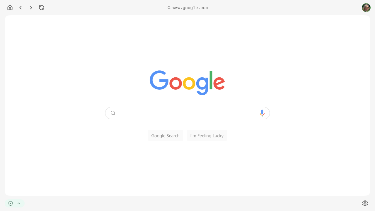
This project focused on the UI design of a secure, enterprise-grade browser platform, developed as a Browser-as-a-Service (BaaS) solution.
The platform can be understood as a Chrome-like environment, built for organizations that require strong security boundaries, role-based access, and multiprofile workflows.
Working closely with a UX Lead, I helped define a flexible interface system that supports secure task execution, profile switching, and contextual access to tools and information based on user permissions.
The client brought us on as a two-person design team (two UX Leads and myself as UI designer) to build the platform’s interface directly, with no separate budget for user research. Progress was validated through weekly stand-ups with the client, walking through the evolving design and adjusting based on their feedback.
Design approach
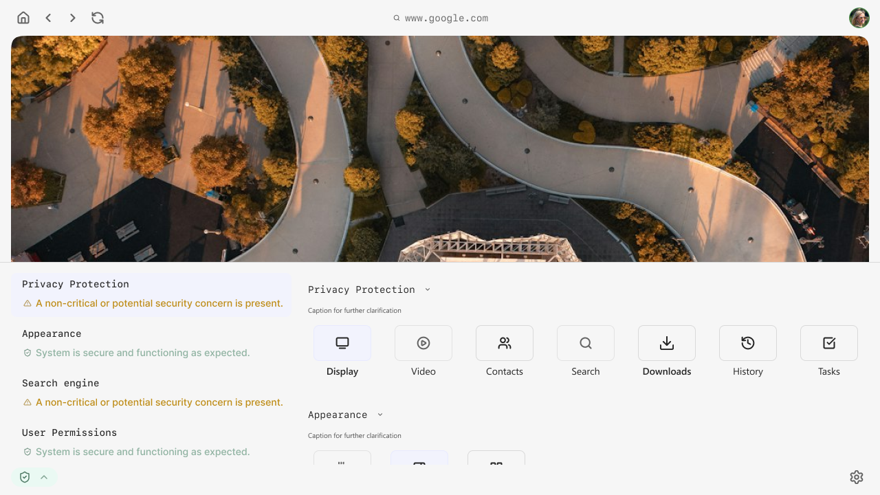
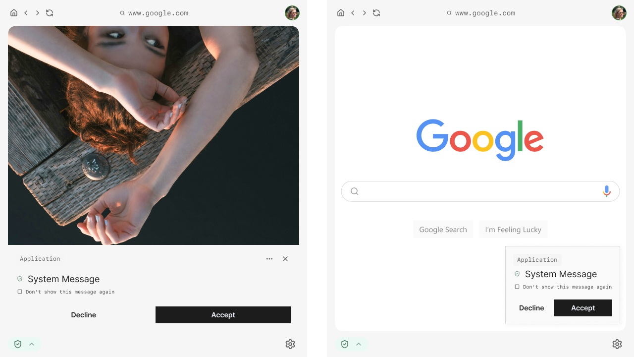
The interface was designed as a modular and layered system, separating security-related controls from application content. This approach allowed the platform to remain flexible and adaptable as the product evolved.
Particular focus was placed on:
- Designing UI patterns that can scale with increasing complexity.
- Making system state and security context understandable without overwhelming the user.
- Supporting efficient workflows for users operating across multiple profiles or access levels.
All design decisions were made with the understanding that the product was still in progress and that the UI needed to support future iteration and expansion.
Role & Responsibilities
I was responsible for expanding the client’s initial idea into a complete UI framework and defining how users would interact with complex, security driven components while keeping the experience clear and usable.
My responsibilities included:
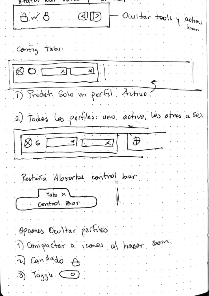
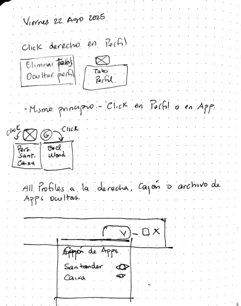
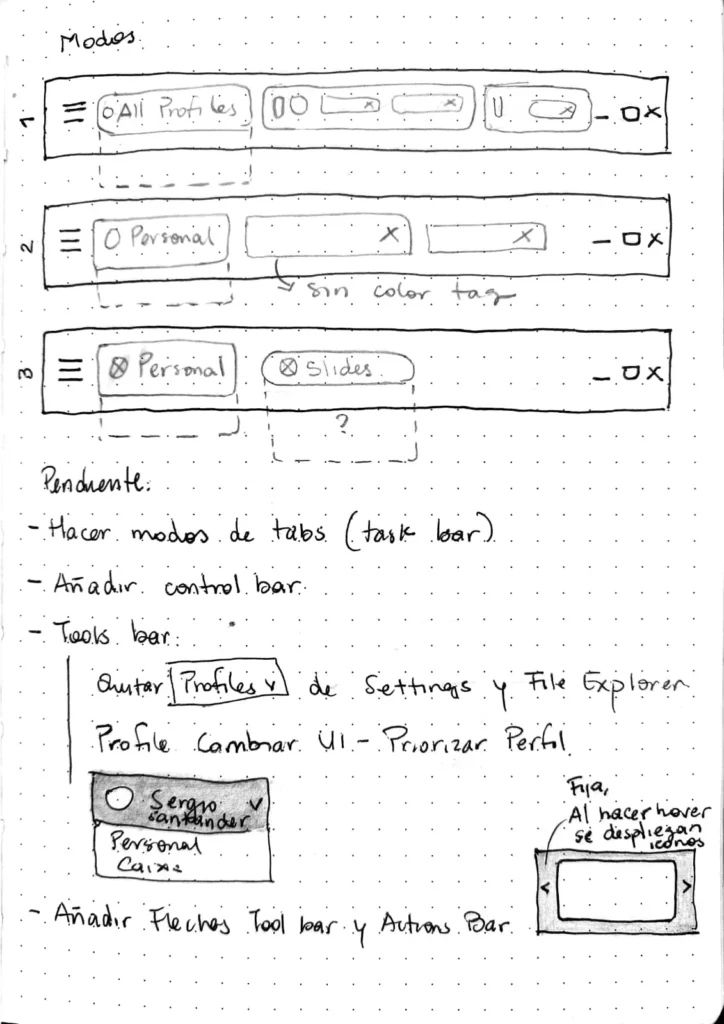
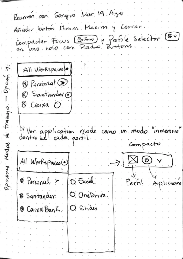
- Defining the overall interface structure and layout logic.
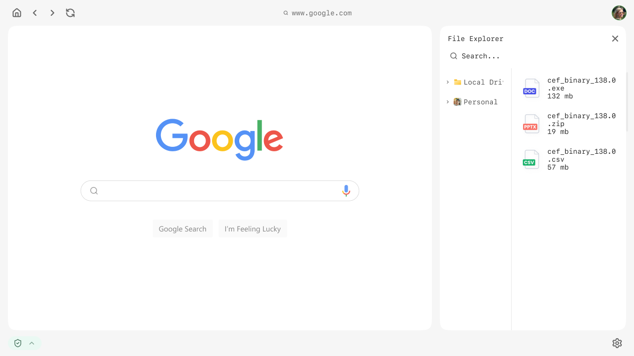
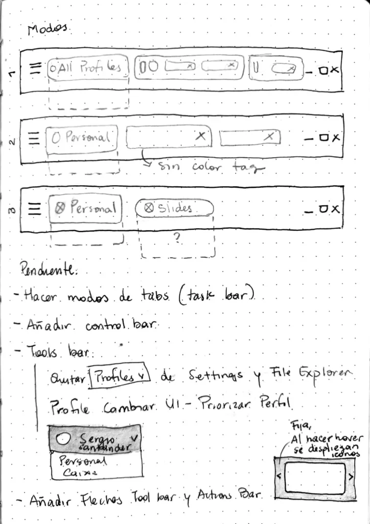
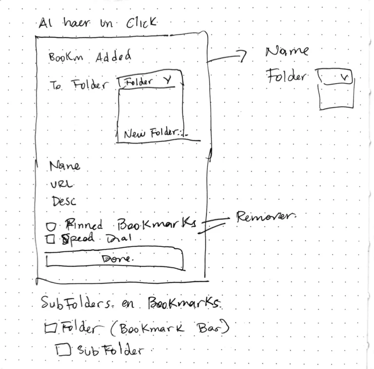
- Defining how users navigate, access settings, and interact with complex components such as the internal workspace and file management experience.
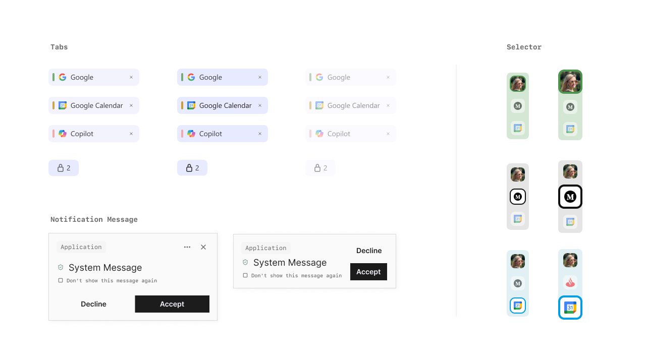
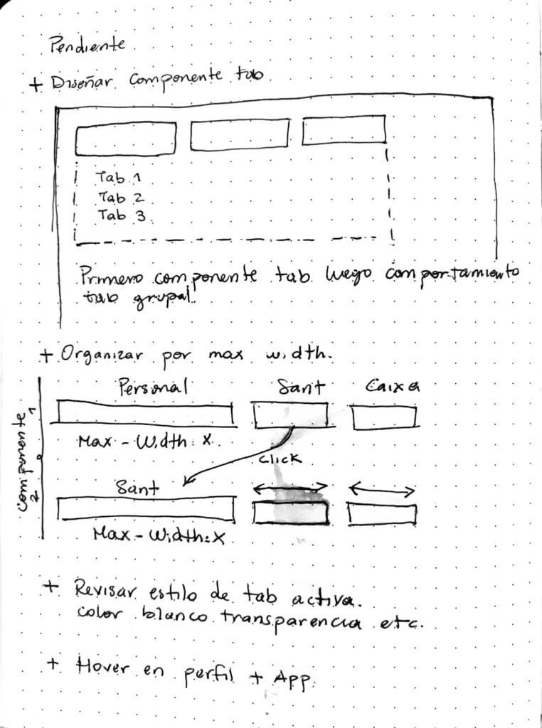
- Building a large component system covering both high-level sections and detailed UI elements.
- Producing high-fidelity prototypes to support validation and development.
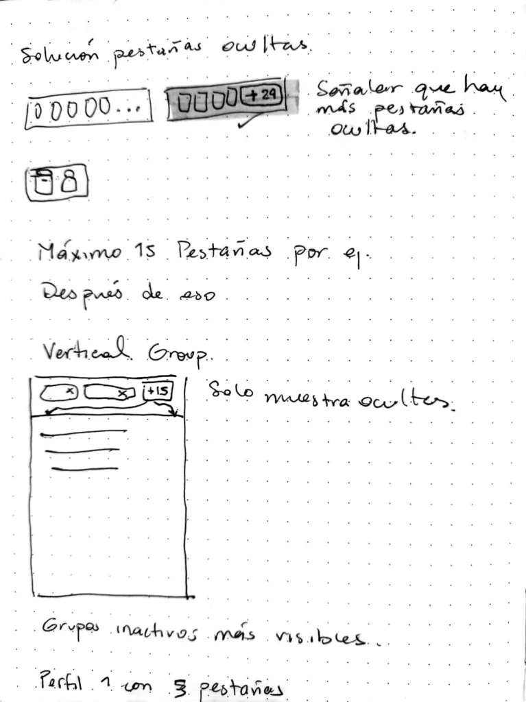
- Stress-testing the platform to determine how it would behave under certain circumstances such as having a large number of tabs open at the same time, or having to switch between many profiles rapidly.
- Presenting the design process and final outcome and discussing future steps with the UX lead and the stakeholders on a weekly basis.
In total, I designed more than 175 UI components, ranging from large structural elements to smaller details such as buttons, icons, states, and system feedback.
Outcome
The project resulted in a complete UI framework, reviewed and approved by the client through our weekly stand-ups, and handed off to their IT team for development.
The deliverable was structured as a presentation paired with a Figma file, broken into sections by platform area.
Each section documented its required components and their use, the design principles behind them, and the visual guidelines (colors, typography, layout) needed to implement them consistently, as well as technical instructions to ensure the components worked properly (minimum recommended width/height, minimum font size, etc).
This structure was built so the team could keep developing and iterating without us in the room.