Secure Browser (BaaS) UI Design
Overview
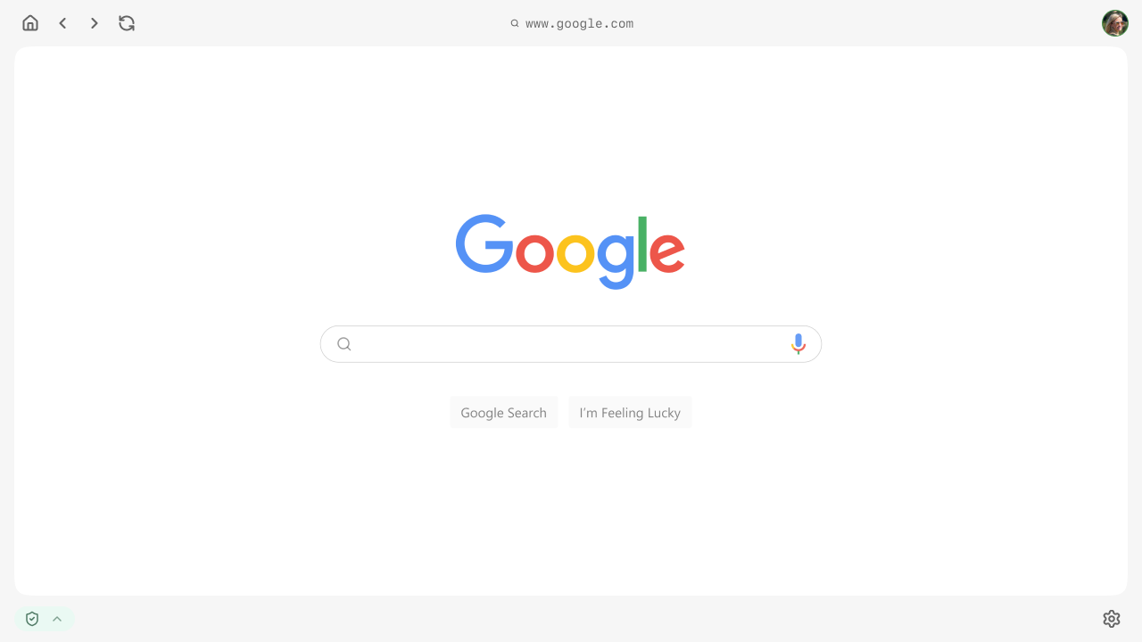
This project focused on the UI design of a secure, enterprise-grade browser platform, developed as a Browser-as-a-Service (BaaS) solution.
The platform can be understood as a Chrome-like environment, built for organizations that require strong security boundaries, role-based access, and multiprofile workflows.
Working closely with a UX Lead, I helped define a flexible interface system that supports secure task execution, profile switching, and contextual access to tools and information based on user permissions.
Design approach
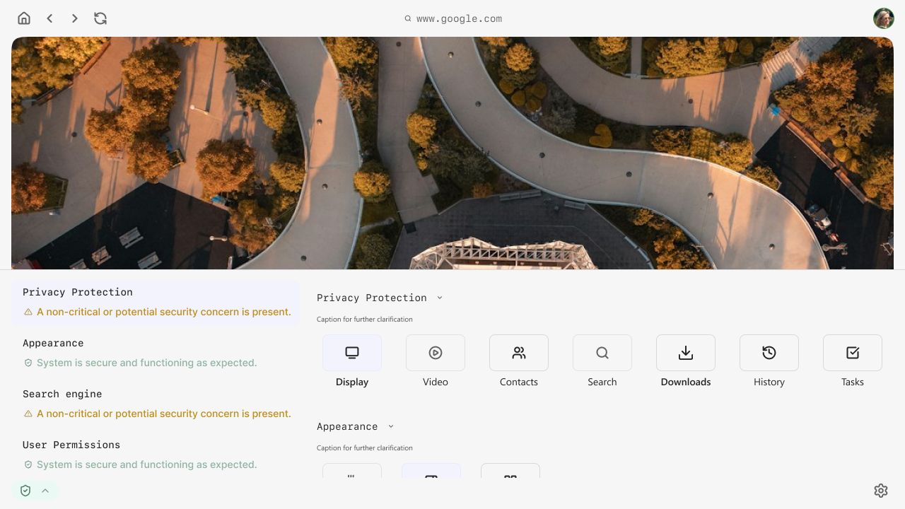
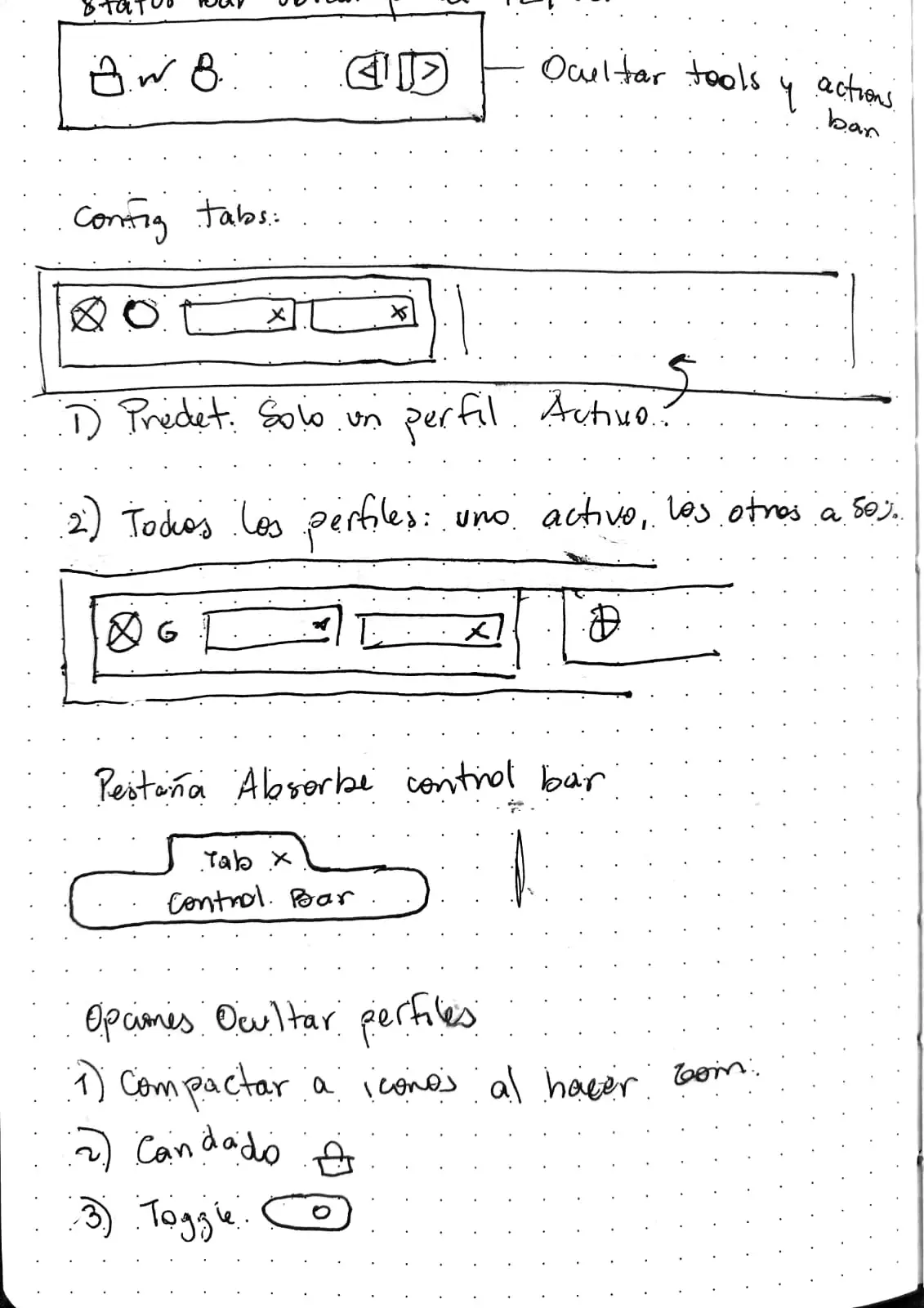
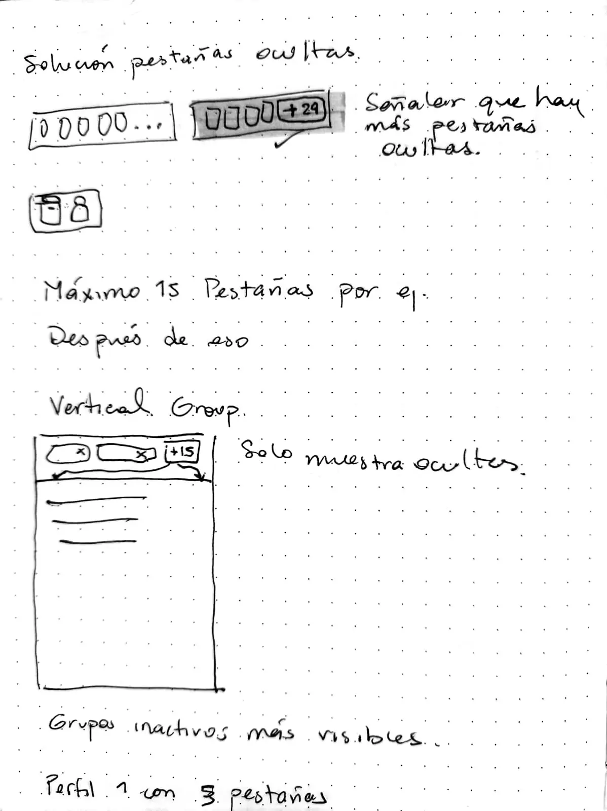
The interface was designed as a modular and layered system, separating security-related controls from application content. This approach allowed the platform to remain flexible and adaptable as the product evolved.
Particular focus was placed on:
- Designing UI patterns that can scale with increasing complexity.
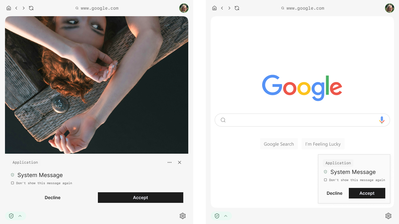
- Making system state and security context understandable without overwhelming the user.
- Supporting efficient workflows for users operating across multiple profiles or access levels.
All design decisions were made with the understanding that the product was still in progress and that the UI needed to support future iteration and expansion.
Role & Responsibilities
I was responsible for expanding the client’s initial idea into a complete UI framework and defining how users would interact with complex, security driven components while keeping the experience clear and usable.
My responsibilities included:
- Defining the overall interface structure and layout logic.
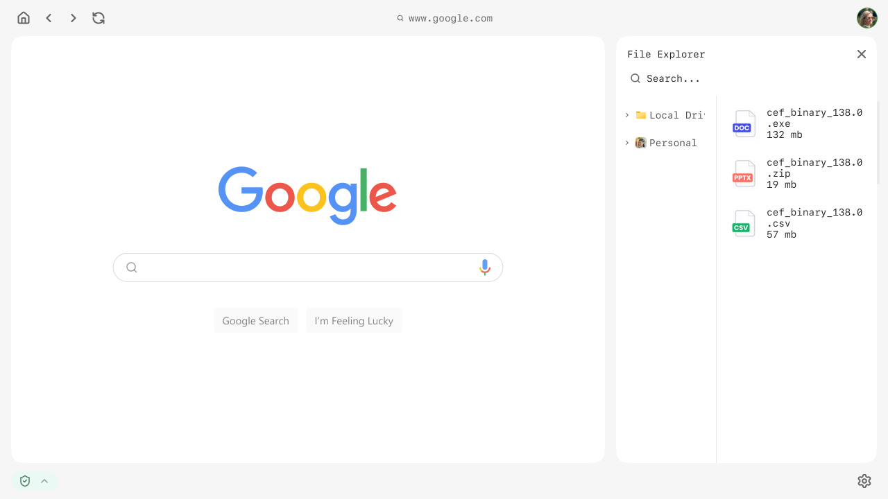
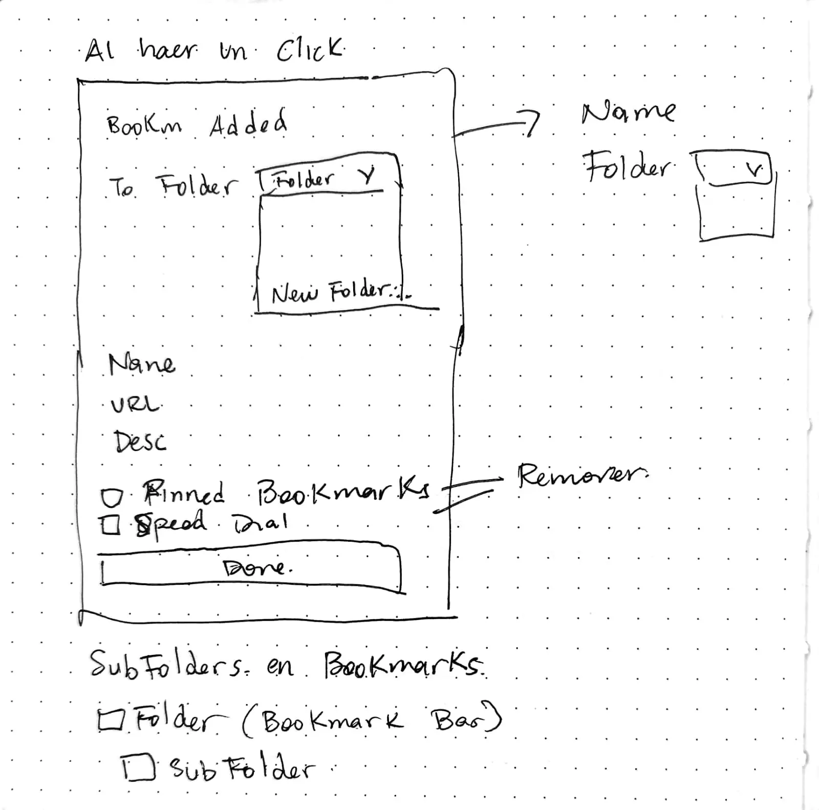
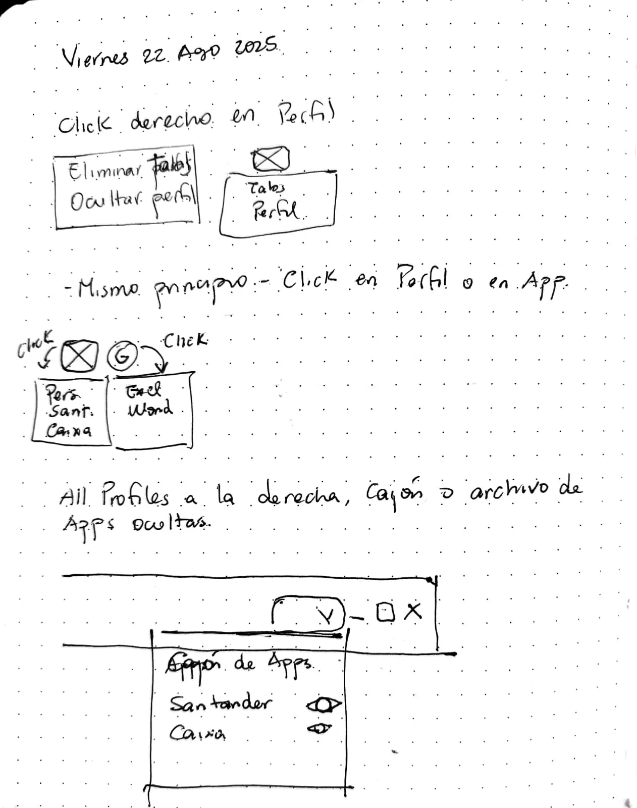
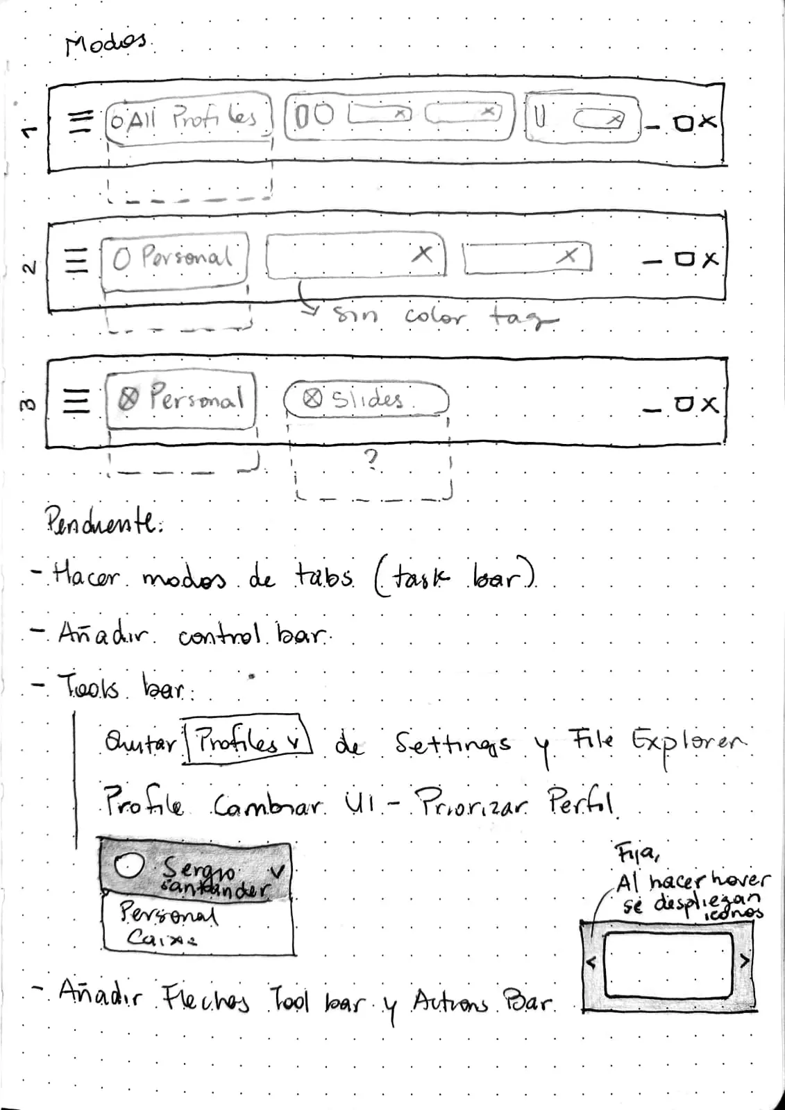
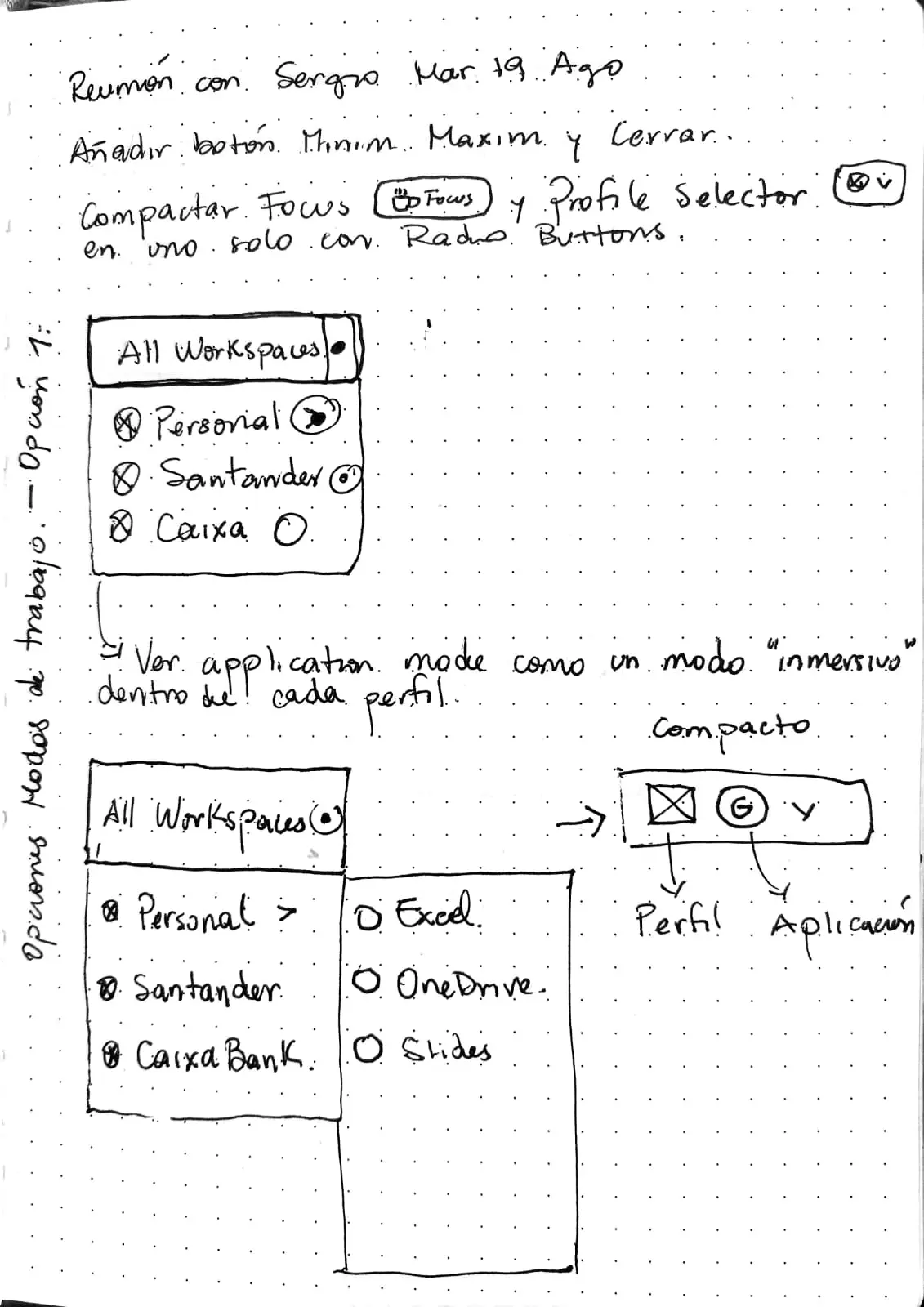
- Defining how users navigate, access settings, and interact with complex components such as the internal workspace and file management experience.
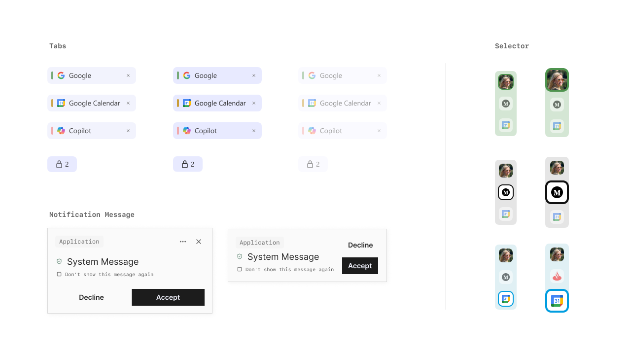
- Building a large component system covering both high-level sections and detailed UI elements.
- Producing high-fidelity prototypes to support validation and development.
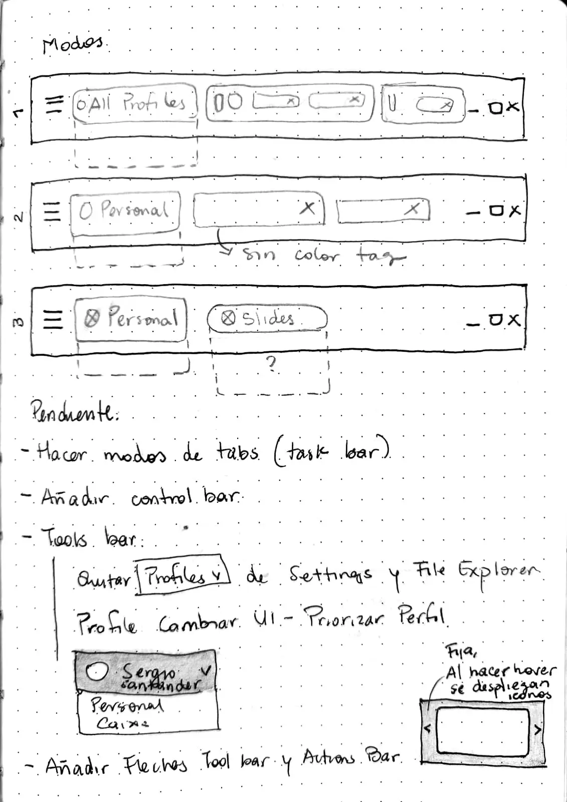
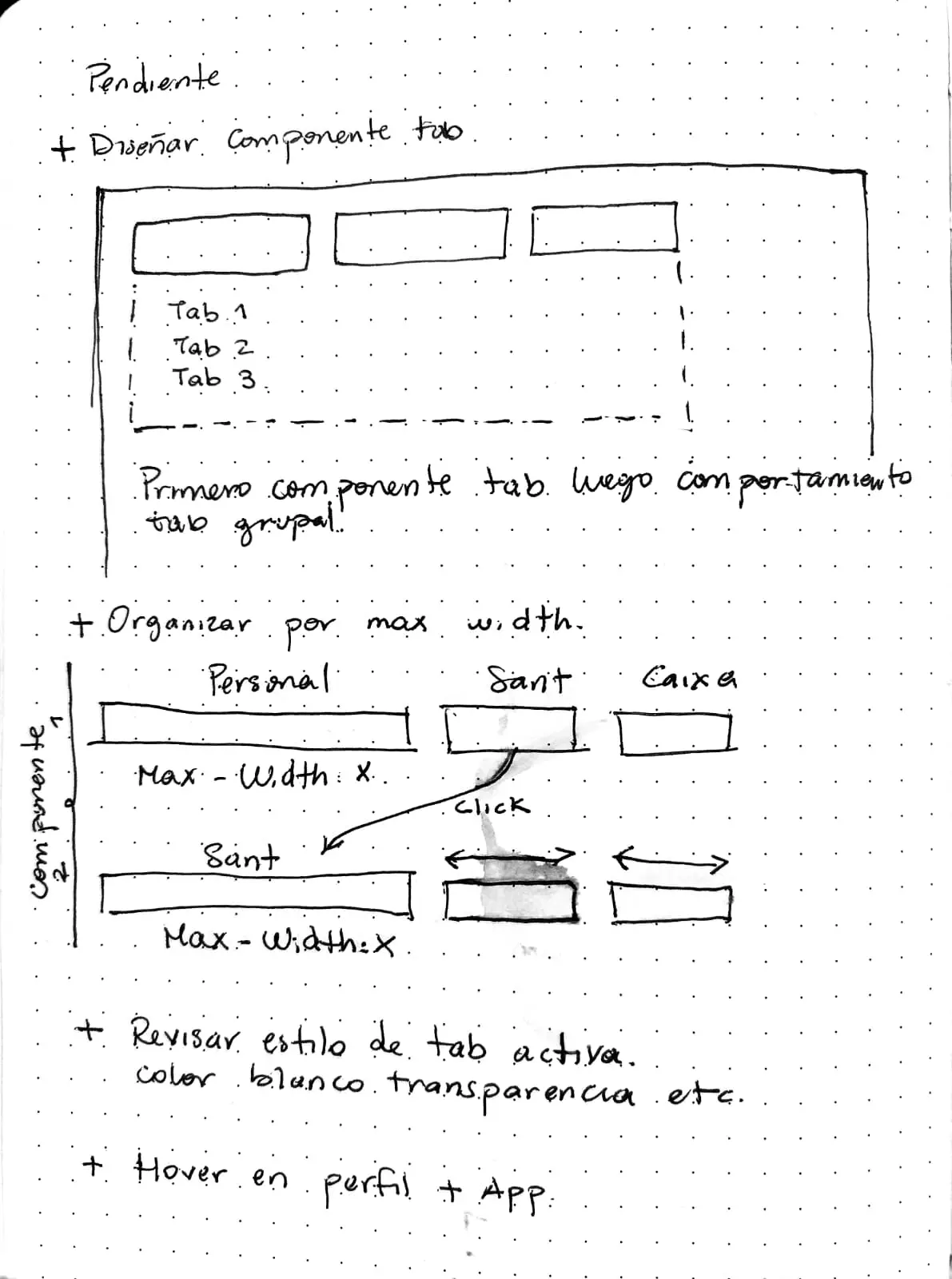
In total, I designed more than 175 UI components, ranging from large structural elements to smaller details such as buttons, icons, states, and system feedback.
Outcome
The project resulted in a solid UI foundation that is currently being developed by the client’s software team.
The project was delivered in presentation format, with different areas to break down each major section within the platform.
Each section described the list required component and their use, design principles to follow, and the creative design guidelines (colors, typography, visual direction).
A Figma file was also provided with all the designs and component systems.
These deliverables were structured to support ongoing development, iteration, and long-term product growth.